Does Your Website Leave You Feeling Stuck? | Website Design Class With Promise Tangeman
If you don’t know who Promise is, let me tell you….YOU are missing out. This girl has her “ish” together in terms of all things web design/graphic design/fashion. She is basically that girl that many look at and say, either out loud or under their breath…”Man I wanna be as cool as her! “. Lol From her style, her professional know how, her amazing hair, signature sunglasses and glowing smile….she is a leader in this industry that many are lucky to know.
Promise is the owner and head designer at Sitehouse designs. Her style groups are incredibly popular and used by mass amounts of photographers in the industry that are using the Showit platform. Her designs add the perfect amount of professional, sophistication, clean lines, and all around awesomeness most seek for their online presentation. She is also known to create some amazing 100% Custom Sites that just take her creative genius to a whole other level. She has QUITE the amazing team of designers that work for her as well….you can take my word for it…or you can stay tuned and in about a month I will prove it! Wink Wink! : P
During my time at United in California, I took soooo many classes….and “How to Think Like a Designer” was one that I knew I needed to come home and share with all of you! At this point in my career, BIG…HUGE things are happening. My magazine…1 year in the works is getting ready to be released. My refreshed branding is about to grace your presence, and a new website and blog are just waiting to be shown off!
Designing such important elements of your business is a HARD thing. Its not just about pretty colors, fonts and pictures…its how everything works together to sell not just what you are offering, but who you are REALLY as a person. Your website is your very first impression or hand shake with your client…it needs to be a good one, right? So many struggle with creating a site that shows who they are, shows off their work, and then attracts the kind of clients they want to have. I think and NOW truly believe A LOT of that has to do with your overall online presence. When you blog and site don’t match or compliment each other, it can be confusing to prospective clients. If you are trying to sell a brand that IS NOT really YOU….you are probably not booking or booking as much as you could be. Being unique and professional are how artists thrive. And in this class, though I had already started the web design process, it really put it all together in a cohesive way to explain to all of you who are in a place I was not too long ago: STUCK!
So ,below here are some of the notes I took from her slide show presentation. I hope they help you as much as they helped me in terms of figuring out if a Style Group is what I wanted…or if Custom was the way to go. And for anyone that knows me, I think you know which route I chose! : P So enjoy what the ever Fab Promise had to share with all of us.
How to Think Like A Designer:
- THINK STRATEGIC
Design your site around your content (You can control your clients experience by what they see and intact with first)
– Write out all your pages you want on your site.
– Decide the order of pages (Always have ‘Blog’ be the last link on your pages menu/bar)
– Write out all the content first. Figure out what you want to say before you decorate it.
- SHOWCASE THE ATTRIBUTES THAT MAKE YOU DIFFERENT
-Show case your strengths to take your design to the next level
– Those elements that make you unique are what define you. Don’t be afraid to embrace and show off the real you…they give your prospective clients something to attach to and in turn, grow attached to you and your business as a whole.

– Never be afraid to be TOO unique! : P
- CHOOSE THE RIGHT PATH FOR DESIGNING YOUR SITE
– Custom vs. Style Group
Custom Pros– no one will have it, special features unique to you, shows off your authenticity, you can hate YOU if you put all of YOU into it, gives you a voice 100% of the time, you are not limited by your technological or SHOWIT design know how…even if Showit IS super easy to use, it’s a fun process when you find a designer you trust with your site and overall vision.
Custom Cons– Pricey, Risky, Feel Stuck in that you maybe do not know how to change things around. (Find a designer that is willing to work with you to make changes or teach you a few things along the way to make simple changes easier for you down the line when a little tweaking is in order.)
Style Group Pro– you can choose the design you like, not as pricey, instant gratification, doesn’t take as long if you are just plugging in a few things here and there and not changing anything about the structure or template.
Style Group Con– you could have a site looks just like someone else’s….just with different colors, texts, pictures and words. A LOT of photographers use style groups and unless they are style groups that are ‘partially’ customized, its easy to tell they similar to another’s.
***If style groups are perfect for you…YOU HAVE to check these out!
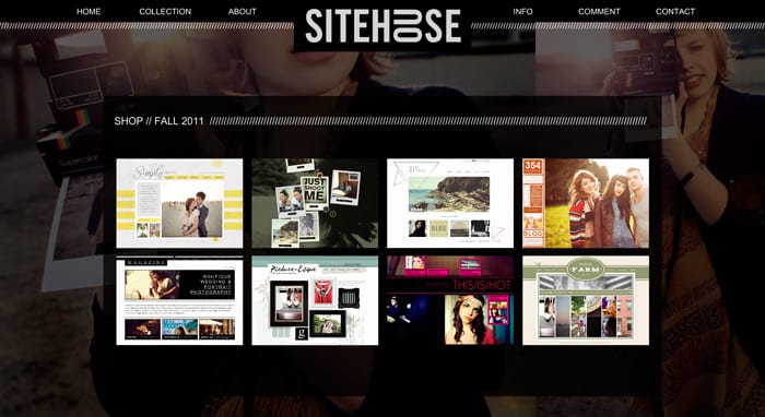
- NOTICE THE DETAILS
– You want to eliminate any obstacles that interfere with the experience of your photography. (Details are FAB to remove any sense of coldness on your site, but don’t over do it. Give your clients just enough about you that they WANT to contact you learn more.
– Your site can not JUST be about your work/pictures if you want to attract clients that value the whole experience over just the delivery of images/products. Photography is SO MUCH MORE than just art. Just pretty pictures. The experience is what creates word of mouth and buzz. Your personality is what helps clients connect. And your work mixed with both things is what keeps them coming back. Remember—in a world of growing professional photographers, many can take a “pretty” picture…But NO ONE can be you, so put YOU in your business and you wont ever fail!
Two main elements in design:
–The main layout- What you see when you squint your eyes at the screen
Here is what I mean- Squint your eyes and you can see the actual layout/structure from which a site was comprised.
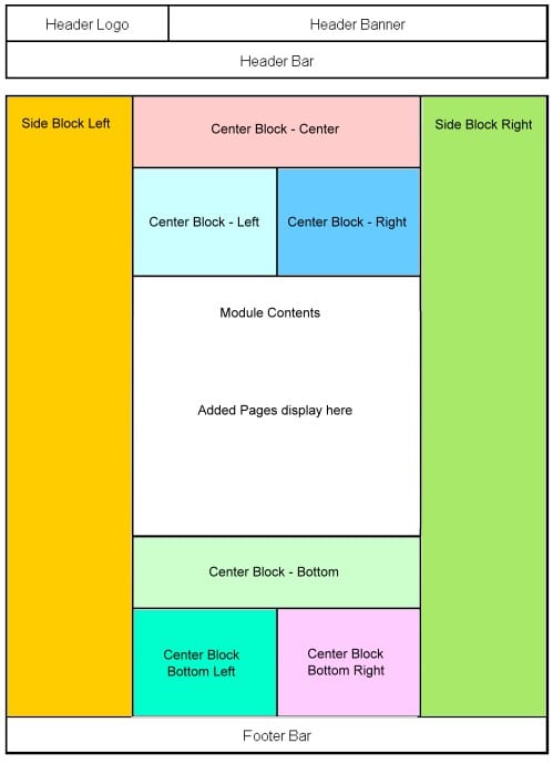
–The Details – GREAT SPACKING, BREATHING ROOM AROUND EDGES OF TEXT, SPACE AROUND LOGO, CONSISTANT USE OF SIZING AND SPACING OF TYPOGRAPHY.
- GO WITH YOUR GUT!
– I really loved when Promise had this on her site. So often we are told or are made to think that we have to watch and listen to what others are doing….that if you want to be successful you have to follow what all “greats” or “leaders” in an industry are saying. Luckily, as a Showiteer…YOU ARE NEVER told that. You are told to be 100% YOUnique!
– If you think a style group is holding you back and you are over being told that you site looks like some ones…GO CUSTOM!
– If you are in desperate need of a site that is sleek and professional and easy/cheaper GO STYLE GROUP! What works for someone else may not work for you…so truly go with your gut and do what you think, feel and know deep down is the best for your business and the future of your business.
As many of you know, I am very much a fan of custom work. My site at the moment is actually a lovely Style Group from the FAB Melissa Love (Another brilliant designer in Showit). It has done my business proud for nearly 2 years and it was exactly a perfect start for me at that time financially and realistically.
Over time, I have developed a style of shooting…and though it still improves and varies with the more knowledge I gain, I know now that custom is 100% the direction I want to take my business and myself. In the beginning its SCARY AS HELL to embrace the real you…because YOU DON’T KNOW THE REAL YOU yet and that is 100% okay! Take your time. Shoot, shoot, shoot until you are happy with the work…your style. Define that, define you, then define your brand and your professional hand shake with the world. It’s a heck of a process, but I can promise you its absolutely worth it.
Cant wait to share my own “custom” story with you ver,y very soon! : )
Good luck in each of your designs!

add a comment
+ COMMENTS