 In my mandatory communications courses, we were giving tips on how to speak more effectively, really sell what we are saying and get others to believe in it, too.
So, when it came time for my results, evaluations and reviews….I was prepared. I took the good with the bad and put a plan on action into play to “per-fect” any errors or improve upon any inconsistencies. Now, as a full-time business owner, I find myself wondering how I am doing in others eyes. To me, I feel great. I feel as though I am in a great place that took well invested time to get to. I feel as though I have learned a lot in a short amount of time and took a lot of the advice I have been given along the way and experimented to see what worked best for me.
I was given advice, what serves now as some of the best advice I was ever given in this career, by Katelyn James (VA Wedding Photographer + Mentoring Coach) that “I NEEDED to rebrand and create a professional and cohesive online presence for my clients.” She stressed the importance of a professional website and cohesive branding strategy to give my clients the best overall experience from online search to final image delivery. Websites are crucial for self-promotion in this day and age and don’t forget you’ll also need a hosting service if you build one, find out more about that here.
At this point in my very new career, resources were slim. I had NOT MUCH to my name and that NOT MUCH was my emergency fund. With nothing but a prayer, some faith and some hope…I threw it all at what she said to do. In the matter of 6 months I made a promo video, got a new logo, new blog, new website, new Facebook, and importantly, NEW BRAND. A brand that was customized to me! Not a website template millions of others had…one that was 100% me….created from a blank page…much like I was.
I had SO MANY people compliment my site. I will forever chalk that up to being my 15 minutes of fame in this life-time. I even had Katelyn James share it on her page…which was one of the TOP MOMENTS of my career…and probably always will be. But what was best of all….was that the compliments they made about my site…were also towards me. I had put so much of my heart and soul into the whole branding process, that compliments on that, I took straight to heart.
Of course there were times of self-doubt and I wondered if some people were just “saying” they liked it because we were friends…they were my clients….they just wanted to be nice. But as with anything you put your whole heart into….its SCARY to just leave it all out there on display.
ITS HARD TO BE OPEN TO CONSTRUCTIVE CRITICISM WHEN THE CRITISIM IS NO LONGER ABOUT JUST A PIECE OF WORK, BUT NOW ABOUT A PIECE OF YOUR SOUL.
So, after about a year, I found out about this new website called PEEK! I was ready to hear what a COMPLETE stranger had to say about my site. My branding. My soul. Holy stressful as I awaited my evaluation. This was NOTHING like law school prep…communications courses, or any other college review. This was now a critique of me and my whole heart invested into “my blank page”.
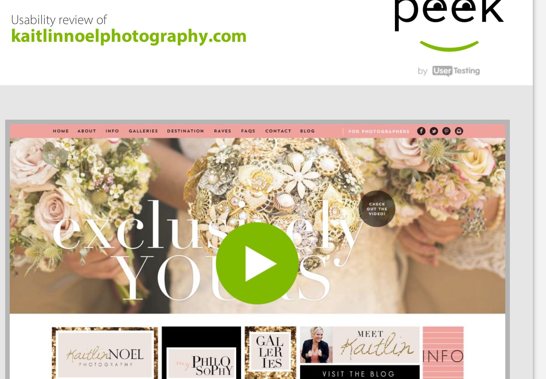
Below you will find the link to see the review of my site. I feel it is important to point out a few things prior:
1. This viewer/critic is viewing my site from a weird tablet. So the technical errors she faces is NOT a universal thing.
2. She ONLY viewed my home page/video. There is so much MORE to a website than that. But I will still totally take what she says! : )
Click right on the image to be taken to the review, it will load in a new browser window for you.
One of the biggest lessons I have learned being in this industry, let alone having a career in the arts, is you are NEVER going to please everyone. NOT EVERYONE WILL LIKE YOU…UNDERSTAND YOU….RESPECT YOU…BE ON YOUR SIDE. That is just the nature of the game.
The right people for you and your business will find you and hopefully become your clients and fan base. The haters or the ones that undervalue your work, WERE NEVER meant to be your client…so don’t be upset when they don’t like you….you don’t want them anyway!
Ok where were we….oh right, the review! So…I took what she said about “exclusively yours” into consideration, but after careful thought….I decided NOT to change it. I appreciate her opinion and advice in regards to moving it…making it stand out more, etc….but for my design…my taste, I like it just how it is. Its subdued enough to blend, but strong enough to stand out as a tag line of mine. I am going to make an assumption that she doesn’t know much about photography, tag lines, etc….but it is HER preference to have it be more legible….where it is not mine. She also mentioned something interesting in regards to the “exclusively yours” that I only caught the second time watching it….she said that “exclusively yours” looks like the NAME OF MY BRAND….when it truth…that is EXACTLY WHAT IT IS. Sure…my business name is Kaitlin NOEL, but my branding experience is all about being EXCLUSIVE….exclusive to my client…the experience and their wedding being one of a kind. So again, perfect!
I also took into consideration her comment about the placement of my logo. Truth be told, my designer and I went back and forth about that as well. She had a point…most peoples logos for their businesses are up top….centered….in plain view. However, THE REASON I ended up choosing this design was simply based on that point…EVERYONE ELSE did it that way…but I wanted to be different. My website address is www.kaitlinnoelphotography.com, so right away people know I am a photographer. They know my name. I could completely understand needing a more prominent/in plain view logo, if my web address said little or nothing as to what I do. So again, I so appreciate that constructive criticism, but for me…its just fine the way I created it with my designer.
Overall, she said I looked like a lot of fun. PERFECT!
She said my website was classy, beautiful, sassy, gorgeous. PERFECT!
Then most importantly, she said she would “DEFINITELY CONSIDER HIRING ME” just based on my website and video BEFORE even speaking with me! This is BEYOND PERFECT!
My online website, cohesive branding, and promo video did EXACTLY what I wanted them to do: Attract, Engage and Entice a client. If she was a real bride, I would totally expect a SHOWIT ROBOT from her and I am confident that if she got to KNOW me behind all of my branding, she would have a full experience and a cohesive look at who I am and what my business is all about….now that we are cohesively one in the same!
If you are interested in getting your site reviewed, check out PEEK. They are awesome…its FREE and you will get some great tips/advice that may really help your clients/user experience.
Remember, your website is your virtual handshake with your client. The first 30 seconds on your website is as strong as a first impression. You only get to make it once…so make sure its a great one…and one that is 100% authentically you!
xoxo,
Kaitlin Noel

add a comment
+ COMMENTS